
Menu
Close

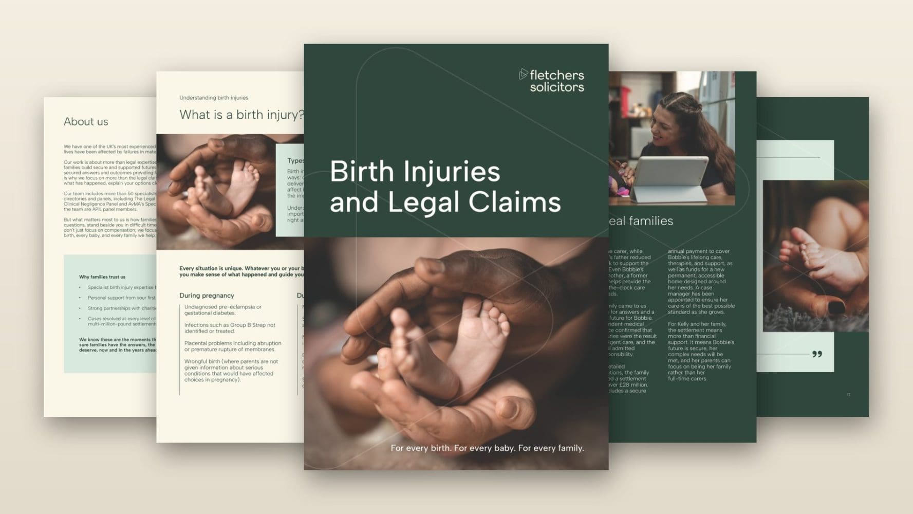
Fletchers already had a strong brand framework. The next challenge was to make that brand work in practice across longer-form, client-facing materials.
The firm needed a 40-page white paper, Why learning in maternity safety is not translating into change, together with two brochures, on Birth Injuries and Legal Claims and Serious Injury: Specialist legal expertise, rehabilitation and wellbeing support. Each dealt with serious and sensitive subject matter, so the design had to feel professional, accessible and carefully judged.
This was not a case of simply applying a logo and colour palette. The materials needed to carry substantial information clearly, while reflecting Fletchers’ refreshed tone of voice and giving readers the confidence that they were in experienced, thoughtful hands.
TBD took our existing brand guidelines and helped us turn them into materials that felt clear, professional and genuinely useful. The team understood the sensitivity of the subject matter, brought strong design judgement to the process and gave us polished communications that felt true to the Fletchers brand.
TBD worked within Fletchers’ existing brand guidelines to create polished digital and print-ready materials that extended the brand into a new form of external communication.
For the Birth Injuries and Legal Claims brochure, we also lightly adapted the copy before design began, tightening the language so that it sat more naturally within Fletchers’ tone of voice. From there, the design work focused on creating a clear hierarchy for readers, balancing detailed information with warmth, reassurance and professional authority.
Across the white paper and both brochures, TBD used design judgement to make the brand work across longer documents: shaping page layouts, handling imagery, bringing testimonials and key points forward, and using Fletchers’ existing visual assets in ways that gave the materials pace and coherence.
The value of the project was in helping Fletchers move from brand guidelines to fully realised communications.
Guidelines are an essential starting point, but longer-form documents ask different questions of a brand. How should a serious quote be treated? How much space does a difficult subject need? Where should a reader’s eye rest? How can a document feel reassuring without becoming soft, or professional without becoming cold?
TBD helped answer those questions through the work itself. In doing so, we created materials that did more than satisfy the immediate brief. They gave Fletchers a clearer sense of how its brand could behave across substantial external documents.
TBD delivered a 40-page white paper and two 16-page brochures, both designed for digital use and print.
The materials gave Fletchers a more polished and consistent way to communicate with clients, families and professional audiences about complex and emotionally sensitive legal issues. They also demonstrated how the same visual identity could be adapted across different kinds of content, from research-led thought leadership to practical information for people considering a legal claim.
The project also created a practical design reference point for future materials. Fletchers was pleased enough with the work to ask for the white paper template, giving the firm a framework it could use to produce further reports in the same style.
Tell us what you are trying to achieve and we will show you how we would approach it.
Talk to us